

Private detective Derrick Peters, formerly of the Park Falls police force, is investigating the disappearance of a local man. The man's car was found outside of town but no trace of the missing man leaves both Derrick and the police baffled. As the investigation continues Derrick is visited by Cynthia Ford who claims that the cause of the disappearances and murders is zombies. But since Cynthia has in the past claimed that the mayor of Park Falls sells children to cannibals up north her claims are met with considerable skepticism. But lacking any other leads Derrick decides to investigate Cynthia's claims and finds that even a blind pig occasionally finds an acorn. Soon the citizens of Park Falls discover zombies are a very real concern, especially after Dr. Daniel Howe is sent to Park Falls by the Department of Defense. Soon Dr. Howe and Derrick are racing to find answers before the outbreak consumes the world.
Overall I was actually disappointed with this comic and I have to regretfully suggest to my readers to just pass this one by. Fortunately it is not because the story of this comic is lacking at all, there is plenty going on to this comic besides just zombies. We get to see the development and motivation of characters, we see their histories which gives them a lot of depth. We also get to see how people cope with a world that is gradually overrun with zombies and how they cope on a psychological level. Overall I felt that the story was well-done and while it has a major downer ending I wasn't left dissatisfied. However a comic cannot stand on the merits of its story alone and good art is essential for a good comic.
I've scanned a couple of pages from Awakening to help illustrate my specific problems with the overall comic. And I'm willing to accept that this might just be my opinion on the matter because art is after all subjective. If you see these pictures and like the art then feel free to check out Awakening.
The first thing I noticed is the tendency for a lot of pages to be dominated by one background color, most of them some sort of shade of brown or blue-grey but some with a sort of pea soup green. I mention this because it's not just the backgrounds that are dominated by these colors, but often the people and objects in the foreground as well. Here's an example:

I picked some pages with as little dialog as possible to help focus on the art. In the above example Cynthia has just told Derrick that the murders are caused by zombies and he tells her to get out. As you may notice the page is dominated by brown and, this is just my opinion, but it looks like it's been stained with tea or coffee. In addition the skin of the characters on this page are the same color as the background. It's not so much of a problem in this instance because of the heavy lines which separate the characters from the background and the color of their clothing, but I just found it unappealing on a visual level. Unfortunately the color is a consistent problem, as illustrated in my next example.

In this page we see Derrick get attacked by and fight off a zombie, however this page is dominated by the blue-grey I was talking about earlier. Now I understand doing the zombie the same color as the background because it's sneaking up on Derrick but why is Derrick the same color as the background? It again forces us to rely on heavy lines to distinguish the characters from the background and makes everything look the same. Another point I would like to make is that the art gets very very fuzzy in this comic, almost as if I have cataracts. Again this is just me, but I prefer the comics I read to have clear, crisp lines and at least some variation of color rather than the heavy lines, dominant color single color and fuzzy edges. I did feel that the art gradually got better towards the end so I included another example.

Again, more of Derrick fighting zombies. In this case there is a little more variation in terms of color and we don't need thick lines to distinguish the characters from the background. The lines are tighter and the action is more visible. However, it still has the problem of being dominated by a single color with little variation, and it's fuzzy in some places. Overall I felt like the artwork could have been done much, much better.
Now, if you will permit me I will include an example from one of my favorite webcomics, The Zombie Hunters by Jenny Romanchuk. Again I have picked an image with minimal dialog to help focus on the art.
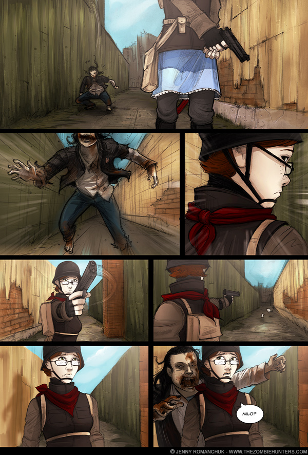
In this page we have the character Katie McWilliams inspecting an alley when a zombie suddenly jumps behind her for a surprise attack. As you'll notice both Katie, the zombie and the background all have clear, crisp lines which provide a great level of detail. Furthermore we can clearly tell both the zombie and Katie from the background through the use of both color and lines. Although Katie and the zombie are both wearing mostly drab colors, the colors are distinct from the green of the fence on one side and the tan of the wall on the other. This helps us separate Katie and the zombie from the background and prevents the page from being dominated by one color. I don't think I can stress the use of color enough in my review here. In The Zombie Hunters most of the backgrounds have brown, grey or other drab colors and provides an overall mood that this is a dying world overrun with zombies. However the characters have little splashes of color which first provides little hints of personality and second helps distinguish them from the background: Katie's red coat, Jenny's orange bear hat, Samantha's blue hair. They help show that these characters are little scraps of life left in a mostly-dead world. Maybe an opinion, but I feel like it's important.
I feel like color could have been used to greater extent in Awakening because we get to see the world slowly be overtaken by the undead menace. In the beginning of the comic there could have been a variety of colors to help imply the vitality of the world before the fall. But as the zombie menace grows they could have incorporated more and more drab colors like brown and grey to help imply that the life is slowly being leached out of the world. It would have been a far more powerful use of color than just brown and grey throughout the whole comic.
Ultimately the story was good and raised some interesting points, but the story alone was not enough for this comic. I found the art to be visually unappealing and detracted from my reading experience. Really I can only suggest picking this book up if you liked the examples of the art that I included in this review. If this is your cup of tea then go for it, otherwise I would just say avoid Awakening.
- Kalpar
Oh, all images are copyright of their respective owners and used under fair use.
No comments:
Post a Comment